Week 14: More UI







UI
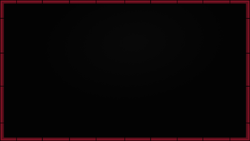
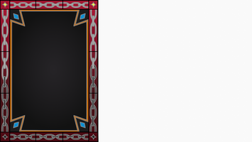
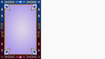
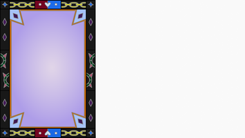
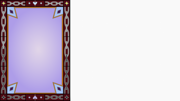
After the text and choice UI boxes, more assets needed to be made for the UI: a side bar for the main menu, an adjustable frame for boxes/menu, bars for both relationship/magic meter, and a name box. As with everything else, base lines and multiple color concepts were created for each of the UI assets. Gradients were experimented with the inner box of the frame, name box, and the side bar to give them a sense of depth. Along with this for the side bar, the outside frame went from lighter to darker from top bottom with changes being made to the design inside it with chains. Originally the magic/relationship bars were meant to be two different color schemes, but was decided that they would be the same aside from the actual changing bar part of it. After all of that, detailing was added to each of them from shading to gradiants.
Sfx Notes
With the UI finished I read through the script to make notes on what sfx’s we still needed and where they need to be.
- Jadin (Total ~ 7.2 hours)
- Create UI for Main menu sidebar, magic/relationship bars, name box, and quit box/ menu frame: 6.2 hours.
- Made notes for what sfx we still need for new script: 1 hour.
Get Soulsnare
Soulsnare
Uphold your oath. Free your soul.
| Status | Prototype |
| Authors | introvertebrate, JadinSomething, Aeroforce0 |
| Genre | Interactive Fiction, Visual Novel |
| Tags | Dark Fantasy |
More posts
- Week 15: Final touchesNov 27, 2024
- Week 15: In the Endgame (Makiyah Harris)Nov 27, 2024
- Week 15: Final Asset, Sfx and Playtesting Update (Jadin)Nov 27, 2024
- Week 14: Home Stretch (Makiyah Harris)Nov 20, 2024
- Week 14: GUI work (Andrew)Nov 20, 2024
- Week 13: More Sprites! (Makiyah Harris)Nov 13, 2024
- Week 13: Implementing static bar and images (Andrew)Nov 13, 2024
- Week 11: Sound effects and adding more dialogue (Andrew Thomas)Nov 13, 2024
- Week 13: UINov 13, 2024
Leave a comment
Log in with itch.io to leave a comment.