Week 13: UI
Soulsnare » Devlog


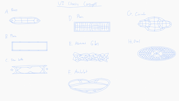
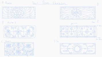
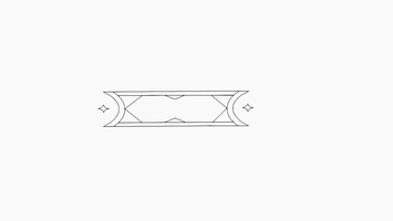

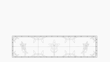

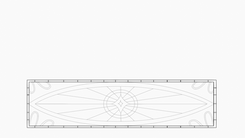


This week’s main goal was to get the text box and choice button finished for the UI. This started created multiple designs for both the box and button. After some feedback I created the baselines for the choice button and two text boxes; we weren’t sure which of the two designs, flower vines and an eye based from the amulet, to go with so I worked on both to see which would look better. With that in mind I created multiple concepts for the color schemes for each of the designs and button, which both were resized to match the pixel size for the UI. After finally decided on the flower design after some changes, I added details to both of the UI and changed the color scheme of the button to match the text box.
- Jadin (Total ~ 6.8 hours)
- Made concept sketches for both text boxes and choice buttons: 1.2 hours.
- Made base lines, created color concepts, and added details to both UI: 5.6 hours.
Get Soulsnare
Soulsnare
Uphold your oath. Free your soul.
| Status | Prototype |
| Authors | introvertebrate, JadinSomething, Aeroforce0 |
| Genre | Interactive Fiction, Visual Novel |
| Tags | Dark Fantasy |
More posts
- Week 15: Final touchesNov 27, 2024
- Week 15: In the Endgame (Makiyah Harris)Nov 27, 2024
- Week 15: Final Asset, Sfx and Playtesting Update (Jadin)Nov 27, 2024
- Week 14: Home Stretch (Makiyah Harris)Nov 20, 2024
- Week 14: More UINov 20, 2024
- Week 14: GUI work (Andrew)Nov 20, 2024
- Week 13: More Sprites! (Makiyah Harris)Nov 13, 2024
- Week 13: Implementing static bar and images (Andrew)Nov 13, 2024
- Week 11: Sound effects and adding more dialogue (Andrew Thomas)Nov 13, 2024
Leave a comment
Log in with itch.io to leave a comment.